Monday, March 27, 2017

Free WiFi near Hubway Stations in Boston, Massachusetts


Table: 
OBJECTID * Hubway Station Spots Per Station
1 Andrew Station - Dorchester Ave at Humboldt Pl 5
2 Aquarium Station - 200 Atlantic Ave. 4
3 Bowdoin St. at Hamilton St. 9
4 Charles St at Beacon St 3
5 Columbia Rd at Ceylon St 13
6 Curtis Hall at South Street 3
7 Day Boulevard 3
8 Dudley Square 10
9 EBNHC - Maverick Sq 7
10 Egleston Square at Columbus Ave 5
11 Faneuil Hall - Union St. at North St. 5
12 Franklin Park - Seaver Street at Humbolt Ave 1
13 Franklin Park Zoo 6
14 Grove Hall Library 12
15 Hayes Square at Vine St. 1
16 Mass Ave at Newmarket Square 2
17 Maverick Sq - Lewis Mall 2
18 Mayor Martin J Walsh - 28 State St 2
19 MLK Blvd at Washington St 5
20 Mt Pleasant Ave / Dudley Town Common 11
21 Oak Square YMCA 1
22 Roxbury YMCA 5
23 The Eddy at New Street 2
24 Tremont St / West St 3
25 Union Square - Brighton Ave. at Cambridge St. 2
26 Upham's Corner - Ramsey St at Dudley St 7
27 Upham's Corner T Stop 4
28 Walnut Ave at Crawford St 3
29 Walnut Ave at Warren St 3
30 Washington St at Melnea Cass Blvd 3
31 West Broadway at Dorchester St 4


Description:
This map is representing the amount of free WiFi spots within a one mile distance to hubway stations in Boston, Massachusetts. The spots on the map represent the different hubway stations, which are represented in table under the Hubway Station section. The lines on the map represent a distance of one mile to the hubway stations, within that one mile it represents the amount of free WiFi spots which are represented in the table under the Spots per Station column. This map could be helpful for anyone travelling through the city especially if they need WiFi to find their way around or find the Hubway schedule! 

Data was collected from Boston Open Data, BostonGIS. 
WiFi Data: http://bostonopendata-boston.opendata.arcgis.com/datasets/4b803745fedd4e88861967d16a1e07fb_0
Hubway Stations Data:  http://bostonopendata-boston.opendata.arcgis.com/datasets/ee7474e2a0aa45cbbdfe0b747a5eb032_0 


Walking Distance to Public Schools in Boston, Massachusetts


Description:  
This map represents the walking distance to Boston Public Schools within two different time frames. The large blue spots on the map represent the public schools. The lighter layer in the map represents the area of a ten minute walking distance to a public schools. The darker layer in the map represents the area of a twenty minute walking distance to a public school.

The total area that represents a ten minute walk to a public school is 25.44 square miles. The total area that represents a twenty minute walk to a public school is 36.92 square miles.


Data was collected on: http://bostonopendata-boston.opendata.arcgis.com/datasets/1d9509a8b2fd485d9ad471ba2fdb1f90_0 and is published by BostonGIS 

Sunday, February 26, 2017

Loss of Prime Farmland in Easton, Massachusetts


Description:

Prime farmland soils are utilized for food production and overall health of our environment and are being affected due to the process of urbanization. This application is representing the total area of farmland that has been lost due to impervious features, such as paved parking lots in the town Easton, Massachusetts. The overall goal of the project is to calculate the total loss of farmland due to development within Easton. 

Process:
To begin this process the team created a map representing our study area, which is the town of Easton, Massachusetts. We then added the soils data which contains the three farmland categories (prime farmland, farmland of statewide importance, and farmland of unique importance) that we would be collecting information for. To do this, we separated the cells that represented the town of Easton and combined them to the soil data. The team then combined an additional subset to the map which contained the data representing impervious areas. To do this we had to separate the cells representing our study area. We then combined the amount of farmland lost for each of the farmland categories. Before we can combine them, we had to create a new field within the table of attributes to make it work properly. In order to collect the statistics of the amount of area farmland lost within the three farmland categories we repeated the process of viewing the statistics given by the table of attributes.

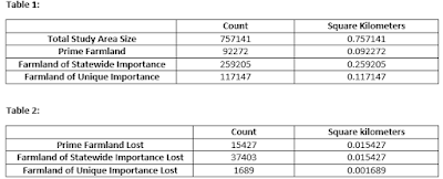
Results: The data collected for our study area represents the total study area size, the amount of farmland, farmland of statewide importance, farmland of unique importance, as well as all three of these categories in comparison to the amount of farmland lost within them. The total area size of the town of Easton equals to be .75 square kilometers. Refer to Table 1 and Table 2 for results. 


Conclusions:
 Maggie Payne, a resource soil scientist presented information that made this study easier to comprehend. She explained the importance of why each of these farmland categories which highlighted the importance of the entire study. There was not many limitations to the study or the process of data collection, but one thing that may make the study more effective is knowing what makes an area impervious. Right now, all that we know is that there is impervious areas that resulted in loss of farmland but we do not know what that impervious land is. I also think that having a timeline of when the land was taken would be interesting because then researchers could look further into if there were efforts to stop the land from being taken. 

Blue Light Maintenance: Bridgewater State University


http://arcg.is/2lwLMFZ

Description
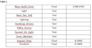
The purpose of this application is to illustrate the locations of the Blue Light locations across the Bridgewater State University (BSU) campus. Each point has data collected demonstrating the accessibility and overall safety of the light. The data collected also represents the safety in regards to the surrounding buildings, population, and general visibility (see Table 1).  


Process  The first step in the process was choosing the focus of the project, in this case it was the Blue Lights on the BSU campus. We created the map with the online ArcGIS program, putting down a base map of streets and zoomed into the BSU area. We used the BSU official published campus map to then add points onto our map – the points represent the locations of the blue lights across the campus. After implementing all of the points we went out in the field to collect data information at nine of the many locations, using the Collector app. We then went back into the online program to ensure all the data was implemented correctly and changed the symbology to represent the points we gathered data for.

Conclusion 
While completing this project there were a few difficulties that we ran into. Before going out in the field to collect data, we added all of the points to our map based off of the Bridgewater State University Campus Map published on their website. When we went out to the field we realized that we could not input data into these points on the collector app. We had to create new points and then go back into the web application and remove the old, inaccurate ones.

Another thing I learned is not in reference to the application itself, but in regards to the overall project. Because we were basing our original points off the University’s published map we were sure that all of our points would be accurate. Unfortunately we learned that there are points on our campus map showing a Blue Light, yet out in the field there was not one. This is important to highlight because we now know that if although something may have been published and approved, there could have been altercations that make that map inaccurate demonstrating that adding the points before going to collect data made this process harder. 


Toxics and Environmental Justice Populations in Norwood, Massachusetts

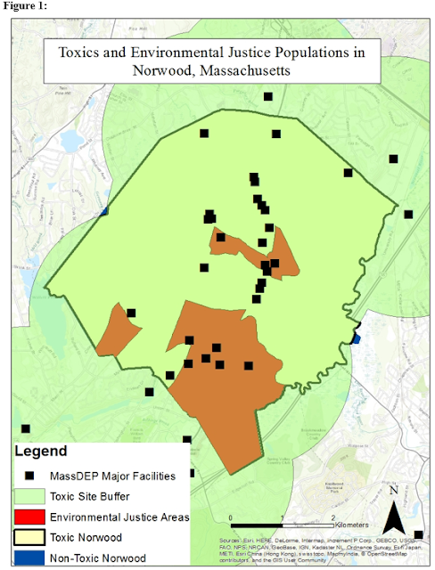
Description: This map is representative of the issue of environmental justice within and around the town of Norwood, Massachusetts. In this project we are measuring the total area of environmental justice within the town of Norwood and comparing it to the non-environmental justice areas. There are also measurements of these environmental justice and non-environmental justice areas within 2000 meters of toxic sites.


The Process: To complete the process of this project there are a few key steps. First, I collected the community boundaries data and the environmental justice populations’ data mass.gis. After adding the layers I collected the total area of the town, the total area of environmental justice areas for the town, the total area of town that is non-environmental justice. After these steps, I then created a zone that is 2000 meters around the toxic sites in the town of Norwood. From this zone I was able to get the percentage of the environmental and non-environmental justice areas within 2000 meters of a toxic site.

Results: The results from the project show the amount of environmental justice areas compared to those that are not, as well as the percentage of those areas that are within 2000 meters of a toxic site. The entire area of the town of Norwood is approximately 27.2 sq. km. Out of that 27.2 sq. km there are only 5.8 sq. km of environmental justice areas equaling to be 21.39%. The other 78.06% are the areas within Norwood that are in non-environmental justice areas, which is approximately 21.38%. From the results it shows that all of the environmental justice areas within Norwood are within 2000 meters of a toxic site. It also depicts that 99.65% of the non-environmental justice areas are within 2000 meters of a toxic site.

Conclusions: From the results of the project it is clear that almost the entire town of Norwood is close to toxic sites. It is important to research the facilities within the town of Norwood to see what type of facilities are producing such extreme numbers. From the study it shows that the majority of the facilities of the town of Norwood consists of automobile sale stores. One must also consider that there is a highway that drives through Norwood that contributes to the toxic environments. The 21.39% of Norwood that is labeled as an environmental justice area are the ones that have the most toxic facilities located near or within them. Further research such as income level could also provide reasoning in which these areas are labeled the way they are.

NASCAR Tourist Map [online map tour]

For this map, I decided to create an online map tour of different NASCAR tourist attractions within the Eastern side of the United States. After researching different NASCAR tourist spots, I had to find their coordinates in order to input them onto the map. For each of the seven spots on the map, I included a link to their website for people to obtain further information if they were interested. I also included an image of the tourist spot onto the map for viewers to get an idea of what the spot looked like. 

The purpose of this assignment was to create a tourism map for a hypothetical trip. I enjoy watching and going to sporting events, but decided to look at a sport that I do not usually pay attention to / know anything about. It was really interesting to learn about different Institutions for people who are pursuing this type of career to attend. I also never knew how many race tracks there are within the United States.